Development Report -12th September 2018
Hello readers, it has been awhile since our last developer update, but we’re back with an update about the state of the game and where it is heading. Since our last update the game has undergone some dramatic changes in terms of the games setting, geographical location, culture and inspirations. The team also had a week break to rest and regenerate but now things are moving quite quickly. With all the changes we have to cover it’s best we just jump straight into the updates, and of course If you missed our last dev log you can check that out here.
As always you can keep up to date with all things Harrowing in the Light over on our Twitter, Instagram or Facebook!

Dev update - Matthew Woods
Hey everyone, I’ve been quite busy these last few weeks and I have a lot to talk about, but I’m going to start with our biggest change, the games setting.
When we first envisioned HitL we thought of it as a strategic turn based-tower defense hybrid. Bringing this idea together as a team and discussing potential game mechanics and ideas, we realised that it was flexible enough to be applied to a wide range of different settings, drawing from real life to fantasy. What we settled on originally was to take the game to Egypt, to have our characters battle an old evil, and draw inspiration from the culture of Middle Eastern mythology. We originally did a lot of research into the types of creatures our characters may find themselves against, as well as lore and history around Egypt in the 1920s to draw into our game, and we came up with a story that we were pretty convinced could work and were all pretty happy with what we were striving to create.
However as development continued we kept straying away from our original goal, the roots of Middle Eastern mythology and taking a lot of creative freedoms with it, this resulted in the overall feel and tone of the game feeling way too westernised to really do the culture and setting justice, but it also lead to design problems in terms of level design. While we wanted our characters to explore the ruins and tombs of Egypt, trying to keep the setting as close and representative as possible to source material quickly became problematic. Tombs are quite tight and narrow, and this lead to quite restrictive gameplay regarding level scale, if we push this room just out a little bit, sure we have more room, but now it looks nothing like an actual tomb would, and thus lost a lot of what we were trying to achieve.
To address these issues we pulled back together as a team and have decided to rework our games setting, taking it out of Egypt entirely and moving it to a new setting that allows more creative freedom and open spaces for the game to exist within.
So what are we doing now? Well, that’s still a bit in the air, although it’s coming together quite quickly. We’re not entirely abandoning the idea of the mythology, and will still incorporate parts of it within HitL, but we’re now focusing on creating creatures and places that allow us to bend the rules to what suits our gameplay and needs.
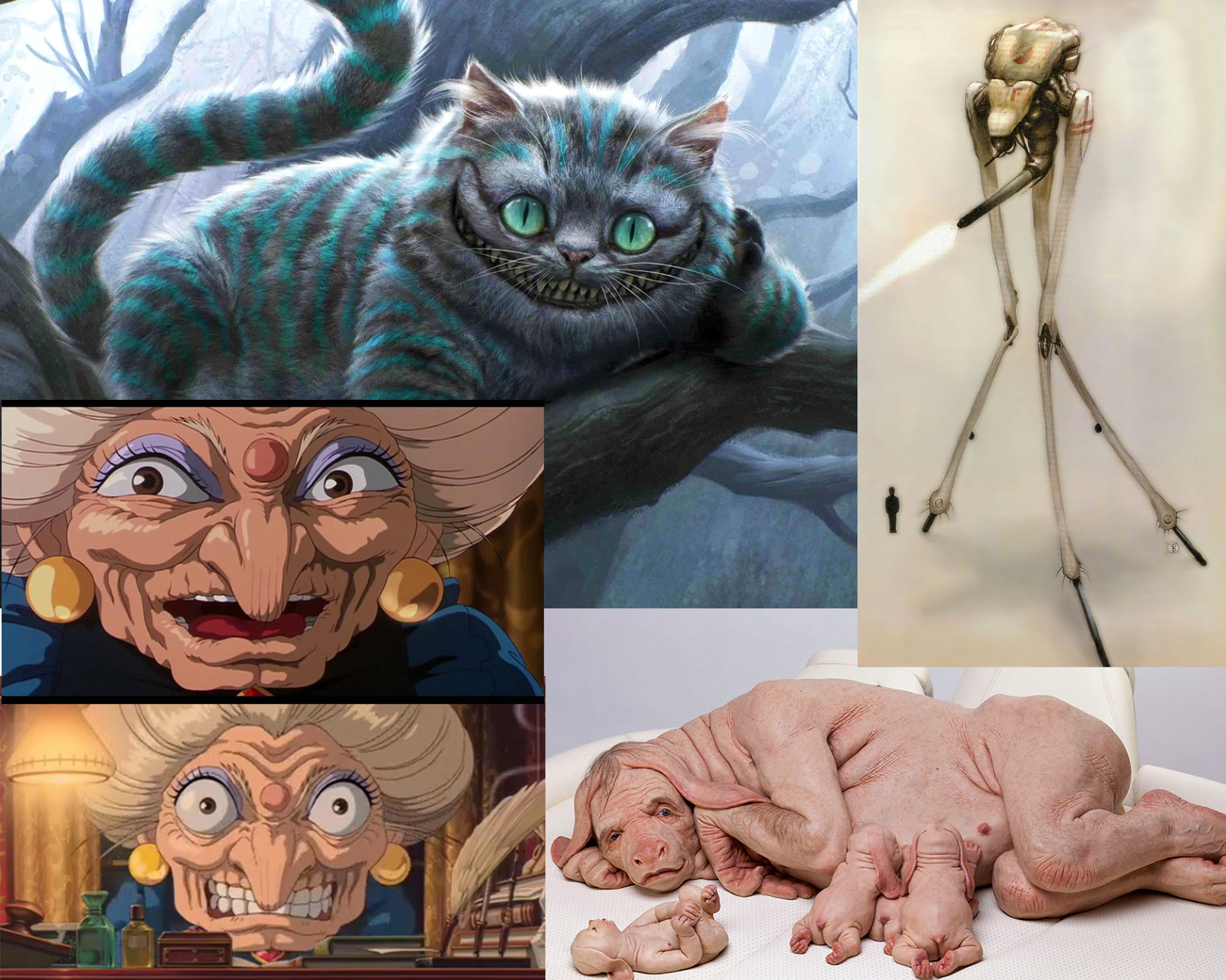
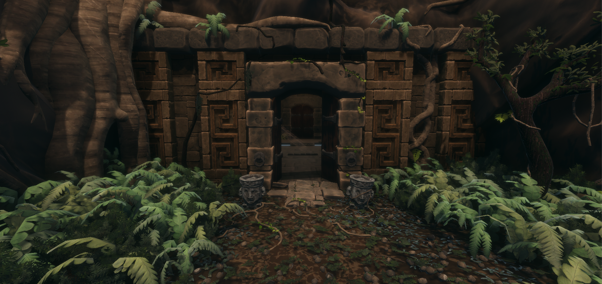
Here’s a quick moodboard I threw together for the team with some visual direction of what kind of direction we were thinking (various images sourced from google images). We know we want to do something deep in the jungle, some place that has been built by a long lost civilisation, but nothing too specific, we’re aiming to keep our story and lore in place (more or less, for what is already there and works regardless of setting) but we want this place to be living, we want the monsters and threat to be part of the ecosystem, part of the ruins themselves, as if the place itself were alive and part of the threat.
I’ll be diving more into this in the coming weeks, but when we now think of the monsters we want to push them in a more grotesque direction, think H.P. Lovecraft, or the wacky designs of creatures that live within Studio Ghibli’s Spirited Away, we want everything to feel weird and somewhat alive, from the mushrooms of the forest to the fleshy overgrowth covering the ruins.
But enough of that for now, it’s time to talk about some of the more backend development I have been working on these last few weeks.
The skill system! (well, actually almost every system) was completely rebuilt from the ground up. Now knowing how the game functions and needs to work and reference various systems, it was a good time to go back and refactor a lot of the base game code while I had the time, from the way characters are handled, to the character class system, exp gaining/leveling, all these systems have undergone some form of change over the last week, and I’m happy and quite relieved to say, it finally works. Each system we have in place can now easily access whichever data it needs at whatever point in time without complex under performing reference calls.
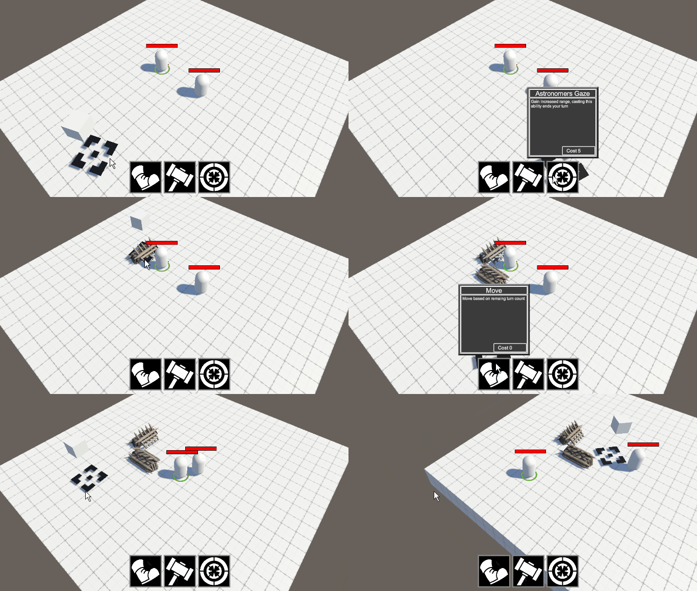
Building fortifications that work with path finding
A few highlights from these reworks and further development are some of the new skills players are able to use. The engineer can now build fortifications to reroute enemies, some will even attack the barricades to attempt to open up a path to reach the players though (Sam has been working on enemy AI and is more in the know with how that stuff will work) and a new combat ability for the sniper where the player can ready their rifle and aim a shot that will penetrate and damage several enemies in a line.
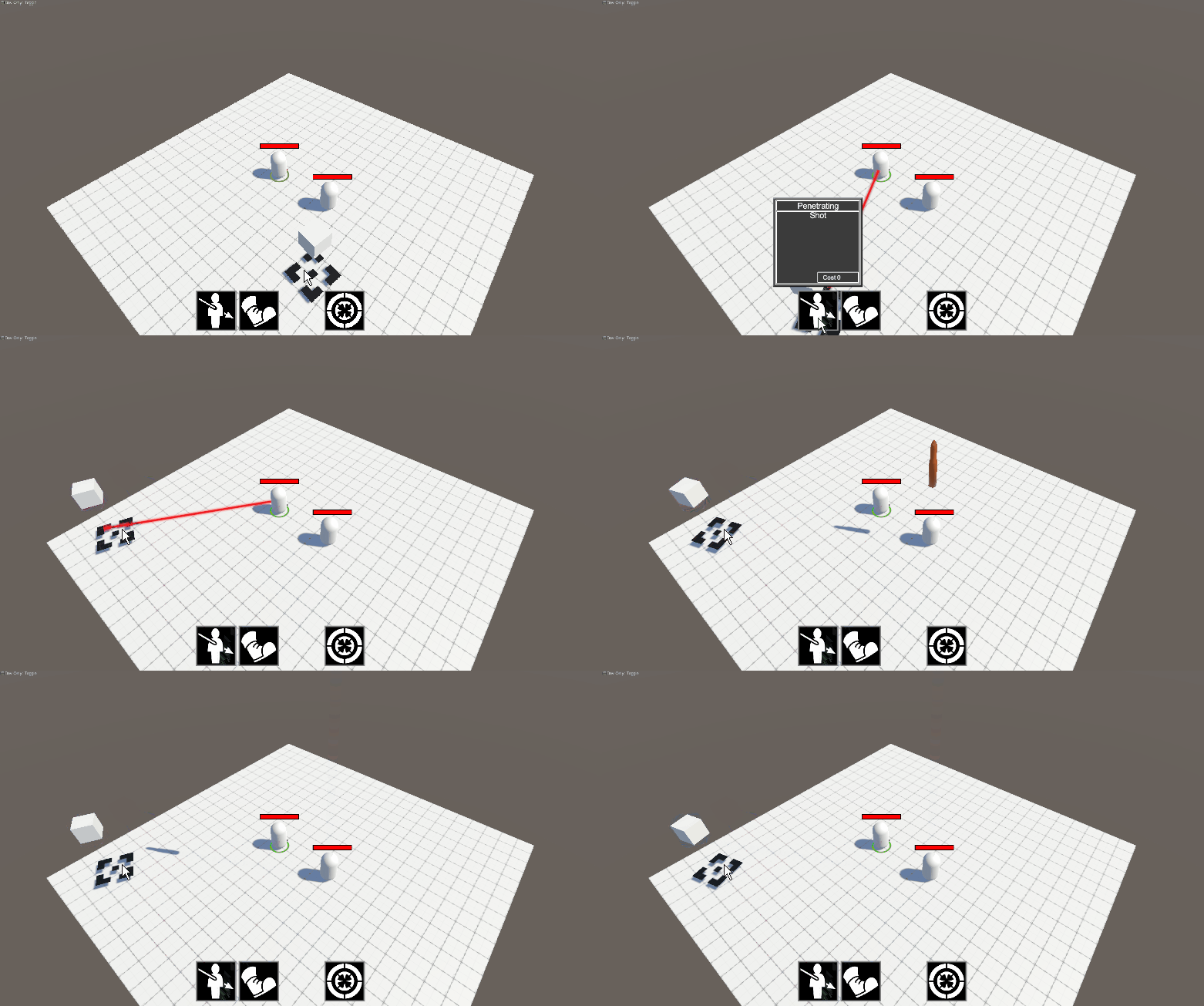
Sniper ability: Penetrating shot - This is what happens when you code all day and then have to work with rotations, you end up accidentally launching a nuke from your allies head instead, whoops!
It’s been a long hard process, but we’re getting there and things are really shaping up in terms of game mechanics and playability, I’ll be heavily involved in the coding perhaps for the following week, but from then on I’ll mostly be building the environments and world for the game which I am thoroughly excited for!
Until next time!
- Matthew Woods - Programmer / Art lead / Environment artist

Dev update - Simone Rizio
Lately I’ve been working on a variety of things for the game, including a mockup UI, UI charts, more concept art (due to a change in theme) and my usual work on the character models.
UI this week included making a mock-up UI for the game, not so much for art style more for layout and usability, here is the first pass made in photoshop:
It includes an Objectives list that will update over time, skills bar at the bottom, and player portraits (both active and inactive, active obviously being the larger one). This section also displays the character’s name, class and class icon, health and turns left (i.e energy). The small portraits display their respective class icon and health bar. Health bars are also displayed over each character model, both playable and enemy characters.
I got some feedback from some other group members and it was decided that some things were good, some things could be reworked/playtested more and there were some things that should be added in the future. From this point, the next step was to make a chart that had every UI element and its respective read (according to Zach Gage’s description - https://www.youtube.com/watch?v=YISKcRDcDJg) , for how readable they should be and their functionality etc, as follows:
Here the UI elements have been written in as types, their subtypes and those subtypes if they have any. From here, their read, option of animation and animated read (if the way the animation was present would bring this UI element to the reader’s attention), if it is a pop-out (i.e a 4th read), and any additional notes.
For example, under the Type “Selected character” (a character that has been selected as the active one), and the subtype Level, and its subtype Current XP. In its description, it will have a small bar (read 3), probably near the health bar, which can be hovered over to have the exact text of their current XP as well as total XP needed to reach the next level.Furthermore, by hovering over the player portrait a textbook will come up with other stats (i.e range,rate damage), and XP will also be located here, as a read 4.
Following on from UI, it was mentioned by a group member that the players will need to collect resources and in time, these can be used for upgrades. To coincide with the story these upgrades (which will be from an old tome, probably found at the start of the game) pages from the book can be found during quests/in secret areas etc. So, it was decided that a UI would be needed to flick through that upgrades book, but in addition to that, as the resources gathered by the characters would be stored in some kind of inventory- they would probably need to be opened up in the same screen to compare quantities of resources to what is needed for a desired upgrade. To do this, I was inspired somewhat by Papers please, and the cluttered feel of having a lot of books and documents to compare (however, I didn’t want to be perceived in a stressful or intimidating way as Papers please does). More like just a cluttered area, and in a design to match explorer’s theme.
I decided this could be, on a table that had explorer equipment around it, as well as the resources “inventory” being a scroll, diary or just some paper that had the resources described in a hand-made look. I.e a handwritten font, resources “drawn” or “taped” into the resource page with a tally or handwritten counter next to it.
This is my rough concept art of what i think that might look like:
My ideas for functionality are:
- The doggy ear on the resources page can be clicked on to flick through more pages
- I have shown that the upgrades book has pages ripped out to show more can be found later.
- Click on the upgrades tab or either of the pages will allow the player to browse through more upgrades
- There could be more tabs than just upgrades, but I am not sure what they would be yet.
- I like the idea of some novelty animations (personally I always enjoyed this small details in games) . For example, a fly coming to land on the magnifying glass, a thermos refilling the coffee every few minutes (if idle- since this page will allow for pausing and may be left idle for minutes sometimes).
I added a quick mock-up of this into the UI test I had before, I think it should be a sort of tab that can pop-out (4th read) to enter this screen:
Can just see its tab, hidden away on the side.
Hovering over it will cause it to pop-out and be able to be clicked on, the icon is just of the upgrades book.
Character Work
This is a screenshot of the engineer character pretty much ready for sculpting ! Just needs a few more adjustments on the hair and a model of her tool’s bag she carries, her concept sheet is here if you’ve missed it, I tired to keep it as close to the drawing as I could.
In terms of character work I’ve also been working on the male base mesh and understanding Blender’s rigging system.
- Simone Rizio - Concept artist / 3D Character Artist & Animator

Dev update - Sam Muller
It’s been 28 days. Three Wednesdays since a DevLog has shown up round these parts. Some say it’s just a fabled myth. Legend has it that some were over 2000 words long, to think! What a prosperous time it must have been…
The winds stir on the horizon, a thunderous rain gently creeps into the realm of hearing. As the dust’s unsettled body looms taller on the horizon, the hooves parade their roar with increasing confidence, their self-awareness lost to the magic of the dance. They have come.
Wow, what a terrible line to end that on. How about?
Luckily enough, this town is big enough for the four of them… just (you may recall they had to split a DevLog once).
Following this (incredibly generic) western theme I’ll call myself Sheriff Sam, Sam Muller that is, at your service. (Just as an aside, hold onto the words ‘incredibly’ and ‘generic’. I have TOO many segues and I’m terrified you’re going to forget the reference.) Yes, it has been one, single while but it is okay! I’ve brought GIFts. Hopefully that means I won’t be inclined to write 12 essays more than I usually do, so, in the spirit of keeping it brief, how about we start with a change log? I promise I’ll keep it as short as I possibly can.
Change Log:
· Everything
· (Almost)
I think I did pretty well.
Cool, well that’s it for this week, I appreciate you, I hope you have an absolutely wonderful day and with love, always, Sam <3
KIDDING!
Don’t think I’ll let you get off that easily, I am NOWHERE near my quota of absolutely appalling hyperlink jokes.
(‘Incredibly’ and ‘generic’)
Speaking of incredibly generic (wow, great segue Sam), how about our game’s theme (Ancient Egypt and archaeologists)? Hahaha, what a joke, right? Look, I mean, realistically, I believe we could have done an adequate job at giving it the justice it deserves but ultimately, and very seriously, it comes down to cultural appropriation. We’re a team of four, working on a game that, at worst, is a portfolio piece and we need to consider the light in which potential employers and, hopefully, publishers might perceive our game. As much as I absolutely adored losing myself in the depths of some website about Egypt, I was exactly that, lost. It’s a HUGE, albeit incredibly worthwhile, time sink and given our scope, I can’t get that done to a high enough, or even acceptable, standard without sacrificing too much in other areas. Matt will mention the direction we’re headed in now in his DevLog but just in case you don’t read it (how dare you even consider not reading it?!) I’ll give you my personalized description: it’s something along the lines of undisclosed jungle meets Cambodian ruins (minus the Cambodia) meets roman architecture meets H.P. Lovecraft. I definitely want to throw a hint of Spirited Away in there too. Sure, that might still sound ‘incredibly’ and ‘generic’ but I have all the faith (every single faith) that we’ll throw enough spanners in the work to make it interesting (don’t worry, I picked up a 22 piece set of Duratool spanners when I went to get the 3 piece set of Bosch chisels in the last DevLog, although, sadly, I’m still not sponsored).
Okay, now that my analogies are somewhat warmed up, wait no, I need one more. Um.
Wow, okay, this is a genuine um.
Heck, it turns out googling ‘most mediocre metaphor’ does return anything useful (Metaphor? Analogy? Difference?).
Oh! Okay! Google is like a bool…
No, I lost it… (Something about how bools return?)
You might think I’m joking but this is literal thought to keyboard writing, I’m about as serious as a disapproving father who never once was proud (this is not coming from a place of personal experience, I just really, REALLY needed an analogy(?), shout-out to you Dad <3).
Okay so let’s compare my life to an RPG (definitely an analogy), it kind of feels like I’ve found an exploit that lets me just grind my programming skill effortlessly. That exploit might be Matt. Not really, I’m just saying that because I tried to rewrite and optimize everything, (the change log wasn’t lying, EVERYTHING) I got horribly, HORRENDOUSLY, unwell, leaving me virtually, spiritually, literally and egotistically incapacitated for one and a half weeks. In the span of that time, Matt accomplished what I could not and I, although my ego was partially (entirely) broken, got to reap the rewards. Just to really nail this concept home, Matt rewrote SIX weeks’ worth of code in the span of ONE. I still had to fix everything I had done on my lonesome in those first six weeks but I’ll get to that in an undisclosed number of words.
Meanwhile, here’s a neat little graphic I made to try and convince Matt how the ability inheritance should definitely, without a doubt, 100%, operate:
I lied, I’ll get to it right now (it was 25 words). I’m going to (try to) skip all the boring stuff, like my investigation and adoption of best practices for project organisation (there some good tips in that, definitely worth a read if it’s something you haven’t looked into much), because I promised GIFs as gifts and I shall deliver… in a moment, let me get there in my own time! Take this instead, it’s a write up of the intended functionality of the enemies (you’ll have excuse my handwriting and the state of that notebook, it comes with me everywhere):
See, your patience has paid off, I have now gotten there. My current pride and joy, the enemy pathing system, used to work like this:
Yes, I still think it is pretty hip but it’s not wholly ours. It’s an augmented variation of the pathfinding from, surprise surprise, Sebastian Lague’s A* pathfinding tutorial (I’ve linked it before). It works super well for the player characters but once you start pushing a bunch (like a real big bunch) of requests to it, it starts to get a little ify. I should mention that it’s not Sebastian’s fault (at least, I don’t think it is), we branched away from the series pretty early on. The problem is that, while hip, it’s not also cool AND trendy.
This, on the other hand, is (*toots own horn*). It takes into account multiple spawn points, every objective in the scene and whether it can get to the exit. Every combination of those factors is accounted for and, most importantly, it’s pretty optimized. I used the extended Unity NavMesh system (that’s the official download link), yes that is a thing. It’s an amazing extension that you only know about if you happen to stumble across it (congratulations! You may very well just have). Essentially, I started with getting the NavMesh to bake in runtime when an objective moves (when I say ‘objective’, I mean a destructible object for the enemy, things like torches and barricades):
I followed up by adding something that would serve as a visual representation of the path the enemies would take, which would appear during the setup phase:
Of course, there are always some mistakes, which lead to some pretty interesting interactions:
Anyway... I needed to see if I could take into account area costs and avoidance. This is so that enemies, due to their distaste for light, attempt to avoid things such as torches and, if it is substantially shorter to travel through their radius, are slowed in their presence (assume the pink area is lit):
Next was getting the enemy manager to calculate if an objective was excessively in the way. If it is, it’ll send a group of enemies to very politely ask it to move:
Finally, I needed to get the calculations for multiple spawn points, which you saw in the first gif of the new pathing system. I might have gone a little overboard, since I went further and added some custom inspector functionality to avoid having to calculate the base NavMesh (the shortest route possible) during runtime:
If you’re a GIF connoisseur, you might have noticed that alongside levelling up my programming, I’ve also got really good at making GIFs. That one is mere 87kb. I genuinely feel like I’m directing them; I’m trying to figure out what to show, the composition, framing and how I’ll act out the scene. Maybe it’s time I moved to Hollywood? Oh, that editor script? 53 lines. That’s including all of its functionality and my horribly excessive spacing (I counted, it could go sub 40).
A vast majority of UI has been pulled out too, or at least, it hasn’t been pulled across. That’s intentional, we’ve got a pretty good idea of what works and what doesn’t from our playtests so we’re going to start getting something more permanent in. I’ll let you read Simone’s DevLog for more depth on that but heck am I excited about implementing some of the ideas (THE BOOK STUFF OMGRRRD).
Although... I may have made a health orb. Even though it probably (definitely) won’t get used, I really needed to get back into After Effects and make something more visual. I followed a pretty cool tutorial by Thomas Sawade and although I didn’t finish it, I think the effect is pretty striking:
I can definitely think of a few other things it could be used for if (when) it gets scraped.
Wow, okay, I think that covers most of the interesting stuff. I honestly don’t know how but I’ve managed to represent one month’s worth of work in a DevLog under 2000 words… Does that mean I didn’t do enough? Or have I just gotten better at this?
Either way, I appreciate you, I hope you have an absolutely wonderful day and with love, always, Sam <3

Dev update - Chris Smith
Coming off the holidays I spent this week finishing off the last off the animation cycles for the current enemy type. There are at the moment 7 different animation cycles all no longer than 160 frames in length. This includes a basic walk, run, jumping attack, standing attack, a walk back, a death and a idle challenge cycle. Depending on the direction of the enemy behavioural code that is in the works I may also have to add a side step animation cycle to the list.
Upon conclusion of a midterm presentation of the project our feedback from a mentor indicated worries over our original design choice for the themes of the game. After some discussion we have decided to shift our choices and open up the design themes to follow a more simpler "creepy" design style in general. This frees me up a lot in my area where I was rapidly exhausting my ideas for the enemy variations. The main issue that I have to keep in mind with this choice is not letting the design aesthetics spread to wide. What I mean by this is although my "design leash" has been taken off I still have to keep the overall style coherent.
My first concepts for this new design style I have to say has been very enjoyable to produce this week. I have been able to delve into (for good or bad) the deeper parts of my mind conjuring up crazy and unorthodox ideas. Due to this it's hard to relate to a particular artistic style. The style is better described as a manipulation of recognisable aesthetics. For example oversized eyes or undersized arms and as well as features or items that may not have any logical reasoning being there. This tends to give an unnerving athletic feeling. Similar to my explanation of the corruption of innocents that I expressed in the previous entry.
Unlike my previous concepts I did not actually start with any real goal or aesthetic task. Instead I only thought of something that would look a little weird and just drew it. In the image below the figure on the right I first thought of a large face only facing up with a tongue that hangs in front of the body. After I drew that part I brain stormed the next part, drew it then brain stormed the next part after that and so on.
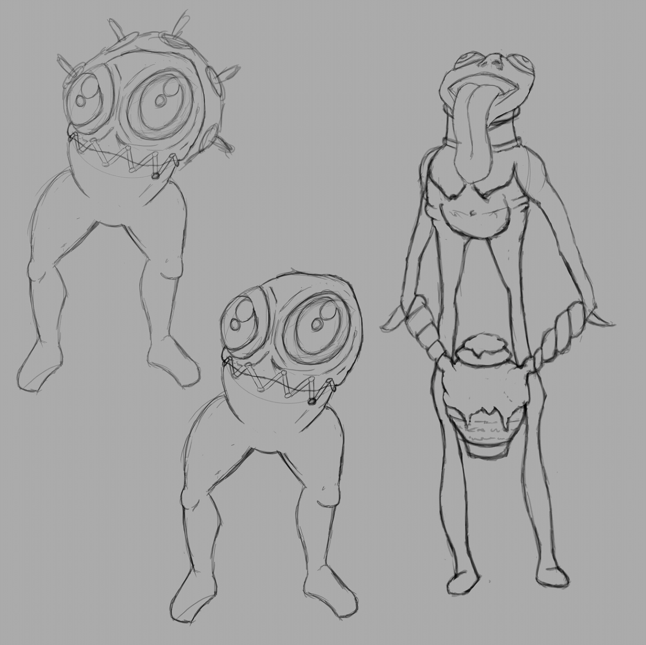
The process remined me of an old drawing game I played in school where someone would draw a part and pass it on to the next person to draw the next part and so on. The whole process felt very natural and well fun to do.
- Chris Smith - Enemy concept artist / 3D Enemy Artist & Animator

Get Harrowing in the Light
Harrowing in the Light
A unique genre mashup of turn-based strategy and intense real time tower defence.
| Status | In development |
| Author | Harrowing in the Light |
| Genre | Strategy |
| Tags | Isometric, Tower Defense, Turn-based |
More posts
- Development Report - 10th October 2018Oct 10, 2018
- Development Report - 3rd October 2018Oct 03, 2018
- Development Report - 19th September 2018Sep 19, 2018
- Development Report - 15th August 2018Aug 16, 2018
- Playtest Report - 8th August 2018Aug 08, 2018
- Development Report - 8th August 2018 - Part 2Aug 08, 2018
- Development Report - 8th August 2018 - Part 1Aug 08, 2018
- Development Report - 1st August 2018Aug 01, 2018
Leave a comment
Log in with itch.io to leave a comment.